
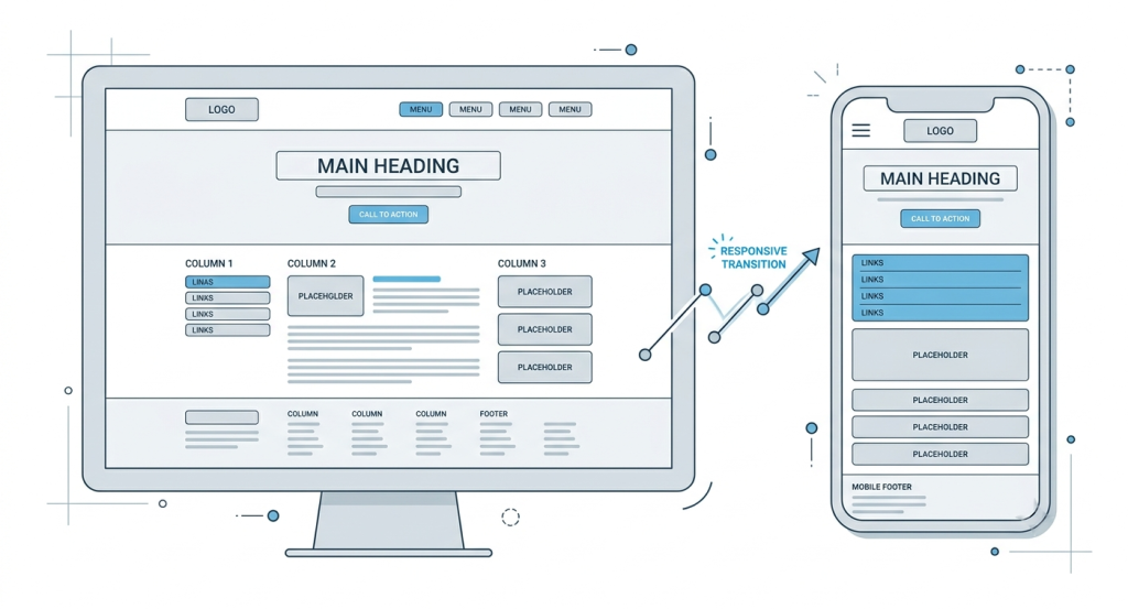
The global transition toward a mobile-first internet architecture has fundamentally reshaped how web applications are developed, deployed, and maintained. For over a decade, desktop environments dictated web design standards, favoring sprawling layouts, intricate navigation sidebars, and heavy graphical assets optimized for large monitors and high-bandwidth ethernet connections. However, data from global network traffic confirms that mobile devices now drive the majority of web interactions.
This behavioral pivot has forced digital entertainment hubs, data networks, and regional gaming platforms to completely re-engineer their backend architectures and user interfaces (UI). Legacy networks originally designed for desktop ecosystems are undergoing systematic overhauls to cater to low-latency mobile browsers, fluctuating cellular data connections, and touch-based user experiences (UX).
Technical Adaptation: Modern Frameworks and Fluid Grids
Transitioning an established web node from desktop superiority to mobile fluidity requires more than simple cosmetic scaling. Early attempts at mobile optimization relied heavily on creating separate mobile subdomains (e.g., m.example.com). This dual-site architecture often resulted in disjointed databases, high maintenance overhead, and severe search engine index fragmentation.
Modern web engineering addresses these inefficiencies through unified responsive web design (RWD). Utilizing advanced CSS frameworks like Tailwind CSS or Bootstrap, alongside modern JavaScript libraries such as React or Vue.js, developers can deploy single-codebase architectures that adapt dynamically to any viewport configuration.
[Server Data Source]
       │
       ├──> [Desktop Client Render] ──> Complex Grid / Multi-Column View
       └──> [Mobile Client Render]  ──> Single-Column Fluid View / Touch Targets
Fluid grid systems replace fixed pixel dimensions with relative percentage-based values. This ensures that visual layouts, data tables, and input forms scale smoothly across varying screen dimensions, from compact smartphones to high-resolution tablets. Furthermore, modern frameworks employ asynchronous data loading (AJAX), ensuring that essential UI components render immediately while heavy computational scripts execute in the background.
Optimizing Touch Targets and Mobile Accessibility
A primary challenge in mobile UX engineering is the structural transition from precise mouse-click mechanics to thumb-driven touch interactions. Desktop interfaces depend on hover-states and condensed menus that are functionally incompatible with touchscreens.
According to standard human interface guidelines, a secure touch target must cover a minimum surface area of 48 by 48 density-independent pixels (dp). This sizing ensures that users can interact with action buttons, form inputs, and navigational arrows without misclicking or triggering unintentional actions.
Additionally, mobile-first design principles dictate that critical navigational elements must be situated within the “thumb zone”—the lower third of the mobile screen where the user’s thumb naturally rests during single-handed operation. Top-heavy desktop headers are consolidated into collapsible hamburger menus or bottom-anchored sticky navigation bars, maximizing the visible viewport space for content delivery.
Secure Routing, Redirection, and Navigational Infrastructure
Beyond superficial UI adjustments, the backend routing architecture of mobile-first entertainment portals must be optimized to guarantee stability. Mobile devices frequently transition between cellular networks and local Wi-Fi nodes, causing intermittent packet loss and IP address changes.
To maintain continuous session state validation and prevent connection drops, web infrastructure engineers utilize lightweight server-side redirect chains and edge-computed routing scripts. In highly dynamic regional gaming and analytical sectors, ensuring uninterrupted access to master servers is critical for data integrity.
When users bookmark an authentic link situs toto or configure custom access paths on their mobile screens, they rely on backend edge networks to accurately resolve their location and route their request to the closest, most stable server node. These optimized access links bypass redundant database lookups, facilitating instantaneous load times even on lower-tier 4G or 5G mobile networks.
Performance Auditing: Core Web Vitals on Mobile
To certify that a platform meets modern UX benchmarks, performance optimization teams continuously audit their infrastructure against metrics like Core Web Vitals. Because mobile hardware features less processing power than desktop units, resource management is vital.
| UX Metric | Target Optimization Window | Mobile Implementation Strategy |
|---|---|---|
| Largest Contentful Paint (LCP) | Under 2.5 Seconds | Prioritize critical CSS, lazy-load non-essential imagery, and pre-fetch primary web typography. |
| Interaction to Next Paint (INP) | Under 200 Milliseconds | Break up long-running JavaScript execution tasks to ensure immediate touch responsiveness. |
| Cumulative Layout Shift (CLS) | Under 0.1 | Set explicit aspect ratio dimensions on images and dynamic containers to prevent layout shifting during rendering. |
By adhering to these strict performance budgets, digital entertainment spaces reduce bounce rates and maintain strong engagement metrics across mobile demographics.
Conclusion
The evolution toward mobile-first UX design represents a structural permanent shift in modern web development. Entertainment platforms that once thrived on complex desktop-centric frameworks have successfully adapted by deploying responsive architectures, touch-optimized interfaces, and resilient mobile routing infrastructure. As mobile processing capabilities continue to close the gap with traditional hardware, the emphasis will increasingly focus on micro-optimizations—ensuring that every digital gateway remains lightweight, accessible, and perfectly tuned for the on-the-go user.
